
Custom Magazine Spread
Tasked with designing a two-page magazine spread for an article of my choice. After watching Quiet On Set, I knew immediately that I wanted to base my design on it. I aimed for a dark and ominous atmosphere to match the heavy, somber tone of the article.
Sketches
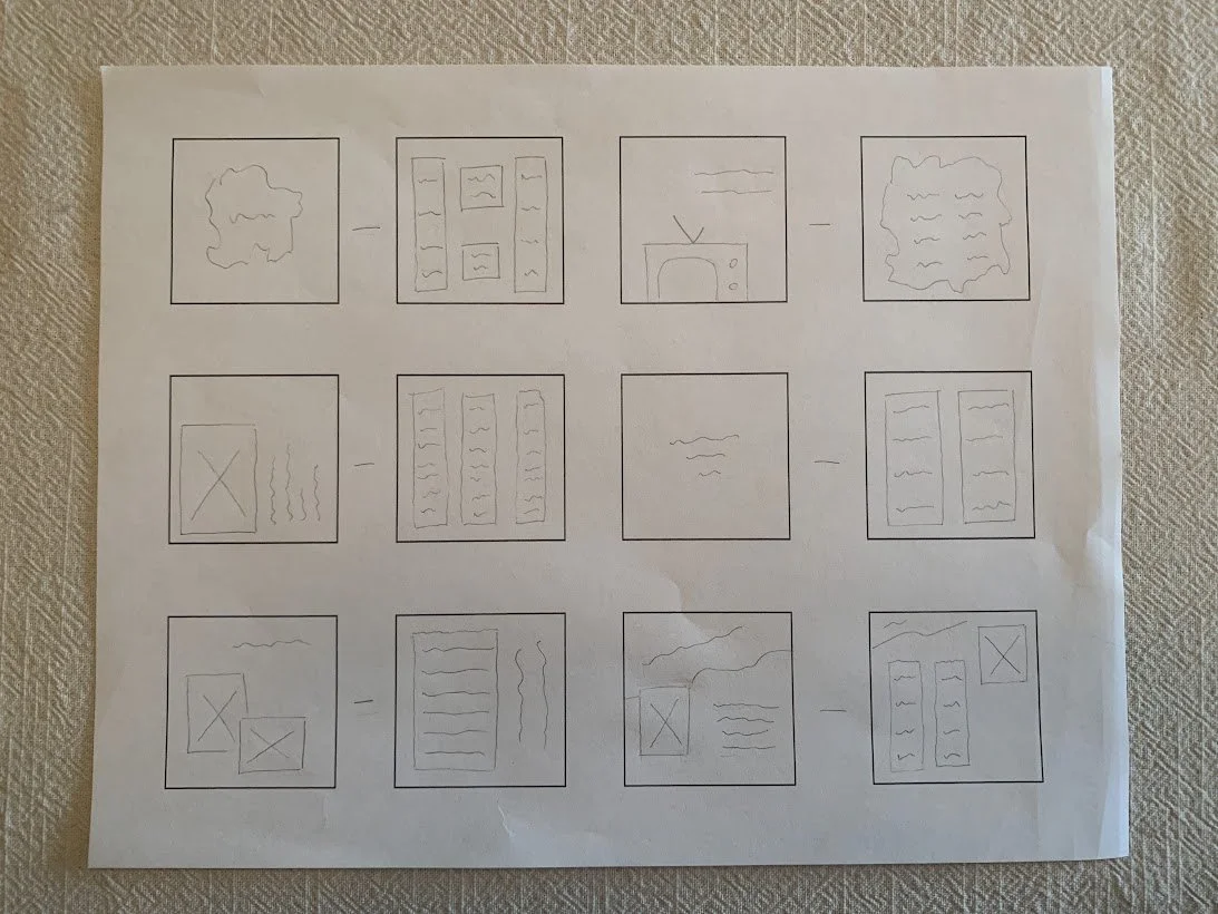
Early sketches allowed me to explore layout ideas, test visual directions, and quickly map out the overall structure before moving into digital drafts.
1st Draft
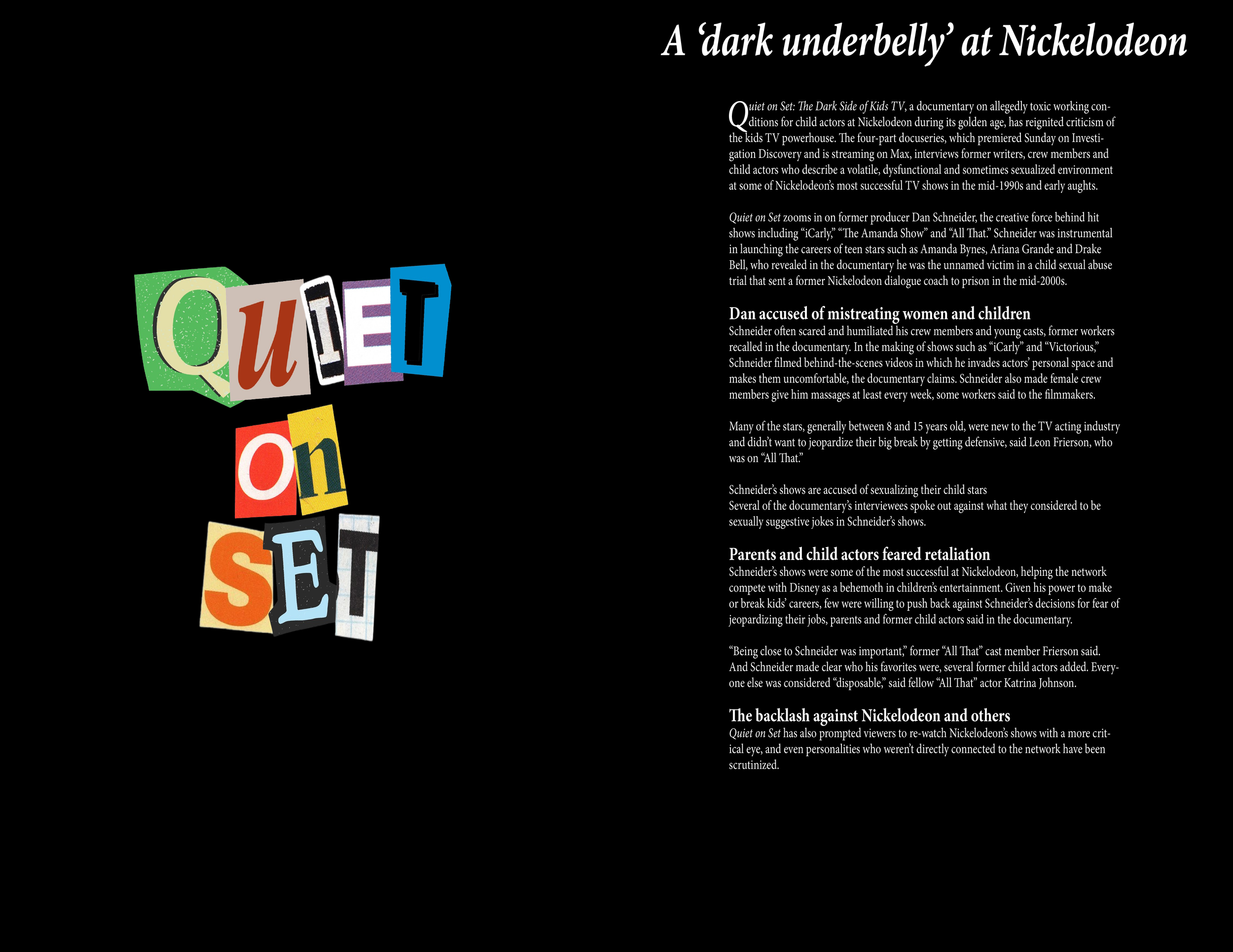
The first draft focused on establishing the core layout, typography, and initial visual hierarchy. This version helped identify what was working and what needed refinement.
2nd Draft
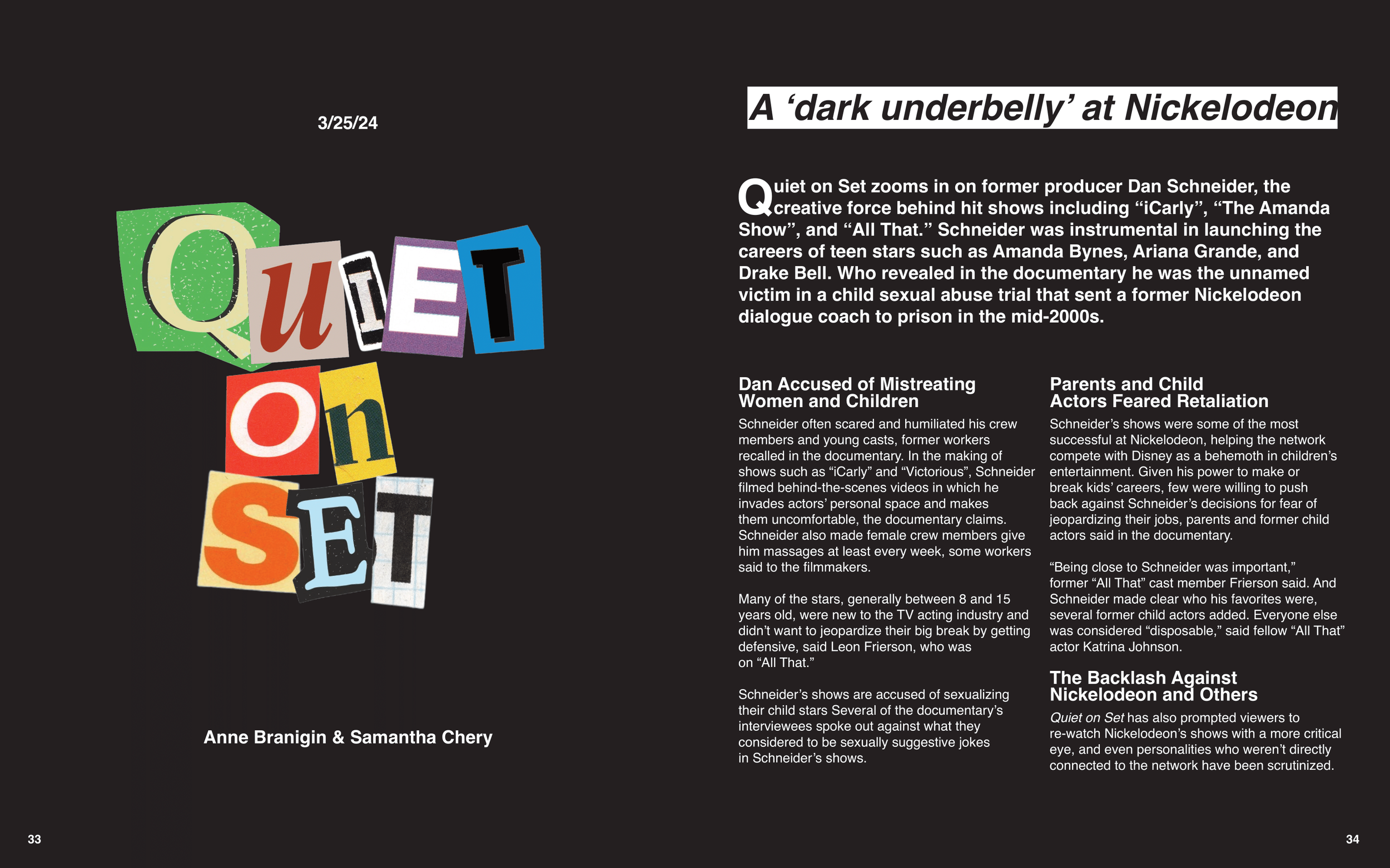
The second draft built on the initial layout with improved spacing, stronger visual flow, and more intentional design choices, bringing the project closer to its final form.
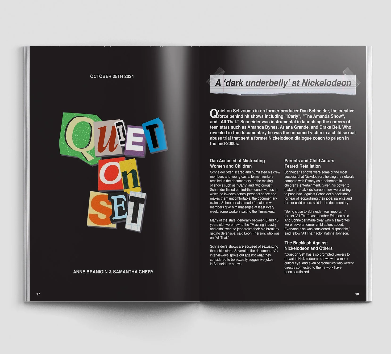
Final
The final draft refined all design elements, polished the layout, and incorporated feedback to create a cohesive, well-balanced composition ready for presentation.